Wednesday, 14 April 2010
Friday, 19 March 2010
Final Polish
You'll all be busy polishing your work right now, so here are some things to consider as we come to the last week of the module:• detailing in type is particularly important: type size, kerning, leading, column width, use of initials etc.
• look back at the brief and check you have covered everything mentioned there - folios, image captions, header/footers for mag name, an introductory paragraph to outline the article contents.
• Use your recto-spread-verso to full effect. Does the first page (the only thing we will initially see) pull us in and want us to read further? How can you be original in your use of content across four pages organised so specifically? Do you use the double page spread well? Does our eye read well across the two pages, or are there visual 'holes'? Are you using white space to best effect.
• Be aware of unity across all elements: does it all hang together and feel like it's part of on magazine? Check over their all their copy and see that everything is spelled correctly but also that it sounds convincing and professional.
• Lastly, you need to keep going and work hard! It always pays off.
Tuesday, 16 March 2010
CR Blog: David James exhibition
 Intriguing blog post from CR about David James and some of his editorial work for a magazine called A Be Sea, where each issue is a letter of the alphabet, and the magazine content revolves loosely around that theme. A neat concept I think, with some really nice pages. Go here to find out more.
Friday, 12 March 2010
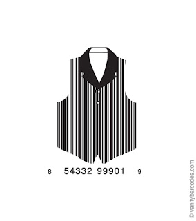
Smart Codes.

Group of people called Vanity Barcodes have started to create some subtle barcodes. If someone is struggling to work a barcode into their cover try this?
Heritage Magazine.

I figured there were people like me who are looking at the heritage side of Plymouth.
Grid Systems - Kimberly Elam
Thursday, 11 March 2010
magCulture
http://magculture.com/blog/
They have stuff tagged by Topic on the sidebar which looks quite useful, eg. the Designers topic, the Front Covers topic ..
Some nice contents pages.
Wednesday, 10 March 2010
Page layout designing example

Cool video, designer recorded his entire page layout development. Shows that it even takes them a while!

Fun video to see how many of the workers could fold this magazine back up. All did it fairly quickly but it shows to not make folded magazines too complicated.
Thumbs up
Monday, 8 March 2010
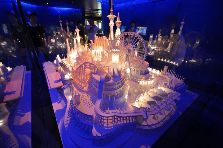
Some Cool Origami

Wasn't sure to post it or not, but three or four people found it useful, so maybe others will , either way its pretty inspirational. Go here.
Friday, 5 March 2010
UPP - University of Plymouth Publications
Thursday, 4 March 2010
Tuesday, 2 March 2010
Free Style Magazine... Frisbee!


magazines that you can't hold

Evidently, Dezeen is 'the world's most influential online architecture and design magazine'.
p.s. Someone fancy submitting a story?
Monday, 1 March 2010
Magazine vs Book
• a set of written, printed, or blank pages fastened along one side and encased between protective covers.
• a periodical containing a collection of articles, stories, pictures, or other features.
Old Skateboards and cool stuff
 Anyone doing skating as their article topic? I found this really cool thing some Japanese guy did in Tokyo where he took all his old decks and made them into strange objects. Go here. Very pretty :)
Sunday, 28 February 2010
Sweet Site
Saturday, 27 February 2010
Plymouth's moving up in the world...

Ok, so this may not be entirely 'relevant' to this module (sorry Steven), but I think this is exciting so I thought I'd share it.
Friday, 26 February 2010
Grids!!

Heres a really good website all about grids, it's got sample grids in all sorts of formats, articles on grids, grid generators, basically everything-you-could-possibly-know-about-grids, plus a list of websites that inspired the site. What I love is that you can toggle between seeing the grid on top of the elements in the site and the regular site without the grid, really useful for seeing how all the elements sit within the grid. www.thegridsystem.org :)
Creative review cover
i-D Magazine
A reminder of terms

These are some WIKI descriptions with hyperlinks so you can read further if you wish too:
A masthead, technically speaking, is the box or section within its pages which contains detailed identifying information regarding its publisher, staff, location, frequency of publication etc. What appears on the front of a periodical, is technically called the nameplate and is distinct from its masthead. For this project wouldn't it be good if you did both for this project? look at your favourite magazine - what kind of distinction does it make between its masthead and nameplate?
Copy refers to written material, in contrast to photographs or other elements of layout, in a large number of contexts, including magazines, advertising, and book publishing. In some fields, copy refers to the output of copywriters, who are employed to write material which encourages consumers to buy goods or services.
In publishing more generally, the term copy refers to the text in books, magazines, and newspapers. In books, it means the text as written by the author, which the copy editor then prepares for typesetting and printing.
In newspapers and magazines, body copy, the main article or text that writers are responsible for, is contrasted with display copy, accompanying material such as headlines and captions, which are usually written by copy editors or sub-editors.
The verso is the back side and the recto the front side of a leaf of paper in a bound item such as a book, broadsheet, or pamphlet. Thus in languages written from left to right (like English), the recto is the right-hand page and the verso the left-hand page.
-
Image: Masthead for a 1845 edition of Scientific American
Initial cover design

This is a first idea I've had for a working cover design (I'm being held at gun point by Steven at the moment). My topic is Francis Drake. p.s i've found a pretty good website for old magazine covers - magazine art
Thursday, 25 February 2010
$1,250 well spent?
I'm never quite sure about this guy but he certainly has a good collection of magazines to inspire and enjoy.


